This project was probably the second largest only behind the battle system.
I wanted a beautiful, smooth, logical, and perfectly working UI.
And unfortunately Unity's built in UI system (2018.4.26f1) is lacking, to say the least.
So as usual, I built my own system from scratch.
The following sections mostly refer to the Pause Screen.
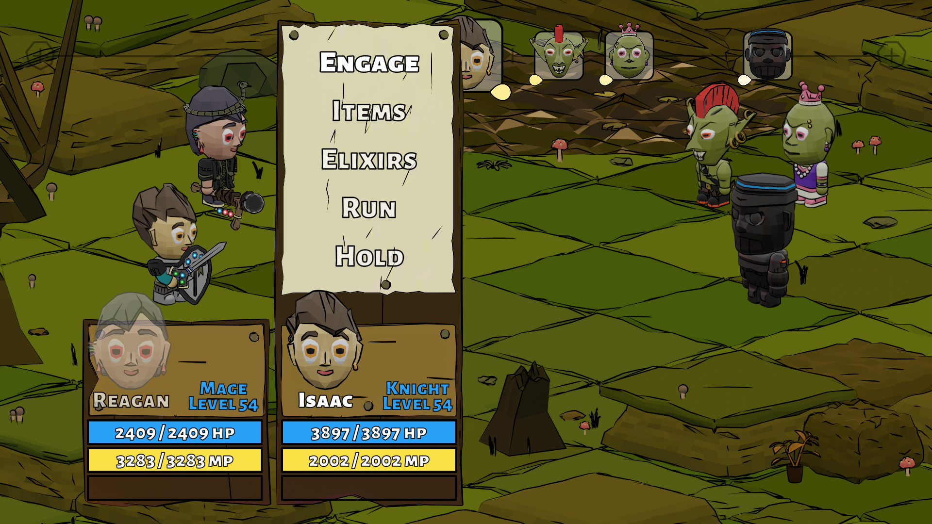
The battle UI basically just borrows the Pause Screen UI :)
The unique battle UI/UX is discussed at the end.
Logical Flow
To me, the most important part of the UI is actually the UX, or User Experience.
But not only does this means it needs to work, and work smoothly, but the entire UI should be planned and laid out in the most logical way.
This generally means organizing categories, themes, menus, pages, screens, etc.
Designing a logical flow for the UI was where I started, and of course, it was done in multiple spreadsheets (and by hand).
This was refined over and over until every aspect made sense, and every "part" was in it's logical place.
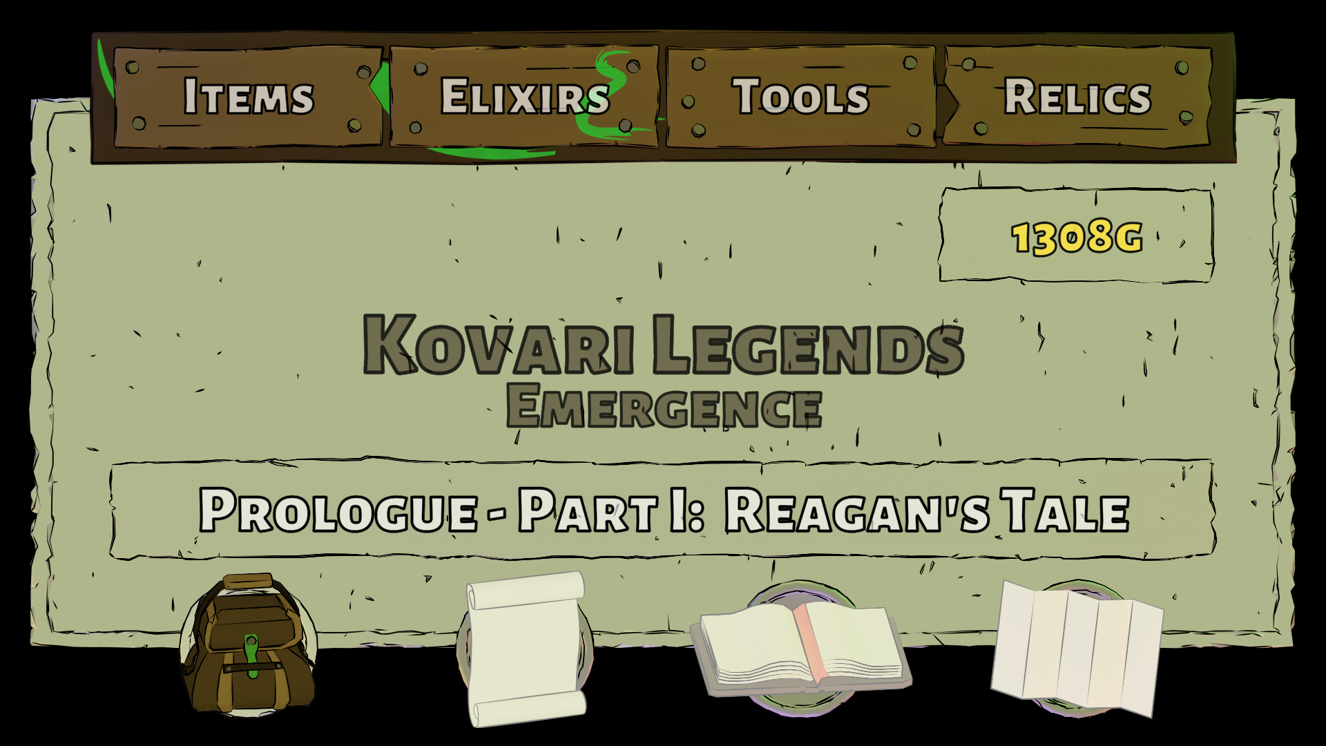
This gave me 4 main categories, or screens, each with 4 subcategories.
The 4 Categories
Inventory:
Items - Elixirs - Tools - Relics
Party:
Gear - Firanite - Magic - Abilities
Journal:
Quest - Errantry (Side Quests) - Books - Settings/Save
Maps:
World - Region - Dungeon - Treasure
Art Design
After the categories and subcategories were chosen, I decided on a "wood panel and paper posts" art style.
It fit my overall low poly art style, as well as the traditional RPG medieval theme.
I made sure all of the wood, paper, and nails had multiple versions and layouts to be more unique.
I then used Inkscape to add some flair to many of the wooden panels.
Lastly I decided on a "coin" background object to display behind all of the assets.
Navigation & Buttons
Luckily Unity's button class handled (most) of the navigation, but still hundreds of lines of code was needed to handle the parts Unity could not.
Sometimes this was just Unity not navigating properly between screens and menus.
Other times it was needed to completely override Unity's default execution with a more desired result.
A great example of this is the "rollover image" effect of the items going from faded to full color.
There was also tons of code needed for the menu stack itself to support going "back", as well as jumping into nested submenus.
Lastly, the actual "action" buttons needed to be as consistent as possible.
This also took a lot of planning, a lot of refining, and a
ton of code.
Honestly, the entire UI/UX probably took over a year to design, create, code, and test.
But in the end, I think it turned out quite nice :)
The Item Panel
This panel definitely went through the most changes.
Originally intended to display information about items and gear, it eventually was used as the main information display for almost everything.
Each section of this panel had to be planned out, then used in unique ways.
Sometimes it displays basic stats, other times a short bit of lore, sometimes Firanite slots, sometimes Tool updates, and more.
I wanted consistency in my UI/UX, and this panel ended up being able to handle it all :)
Misc
Of course there were a ton of design considerations while building out the UI.
Things like vertical or horizontal listing of items, the item combining system, where to put certain panels, party member and gear displays, the 3D gear viewer, the Firanite placement view, quest displays, book navigation, map control and stamping, and more.
All of this was planned, implemented, tested, and refined.
There were also some design changes for the shops and the Tea Time screen.
Of course it is useless to try to "explain" the entire UI/UX, the whole point is to use/experience it!
Oh, and lastly, confirmation sound effects and jingles were added :)
Battle UI/UX
The battle menu UI used the same concepts as the Pause Screen with the panels and menus.
Again, organization was key, with a logical flow of battle commands.
The turn gauge was designed to see the icons moving toward the center box, adding a feeling of anticipation.
Lastly, the battlefield member select icon was added, along with a countdown timer version for Sword Techs :)